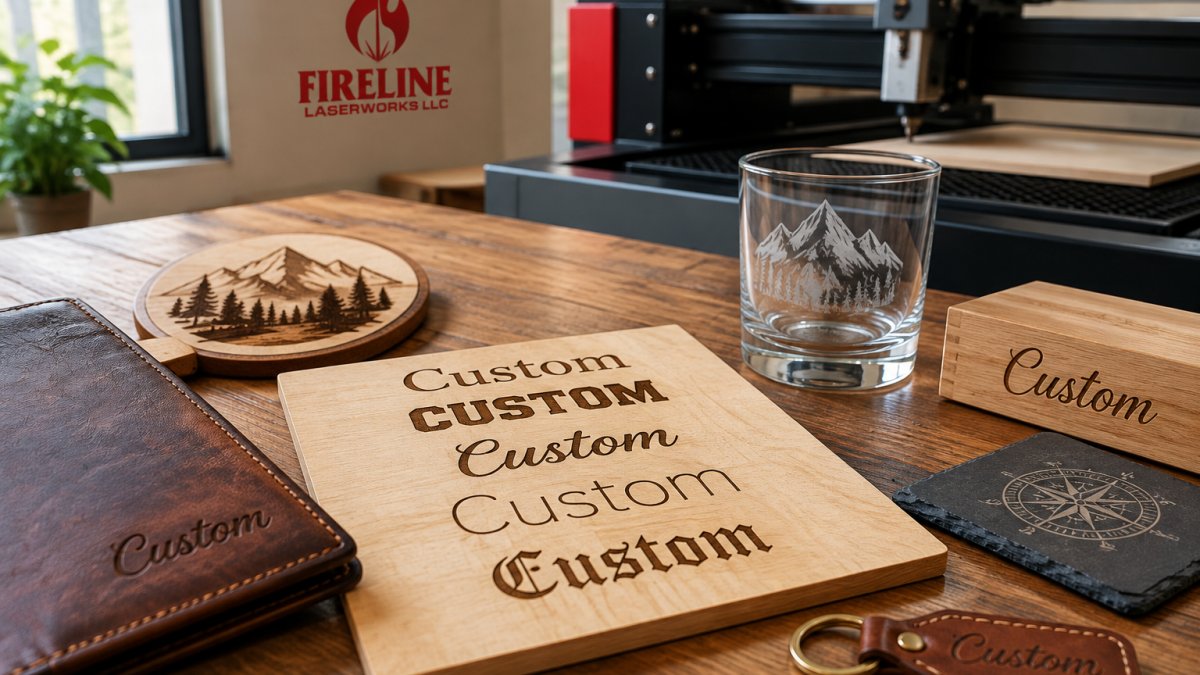
Last Updated: November 5, 2026
Quick Summary
To choose laser engraving fonts, first decide whether your design will be engraved or cut through, since cutting requires stencil-style bridges and wider strokes. Then match weight to material: medium to bold sans serifs and slab serifs hold up best, while hairline and high-contrast fonts fail on metal and small sizes.
- Engraving tolerates thin strokes and tight curves, while cutting demands bridges and stencil-style gaps.
- Bold sans serifs read at small sizes where thin scripts turn to mush.
- High-contrast fonts fail on metal because thin strokes mark inconsistently.
- Diode lasers blur fine strokes, so add roughly 20-30% to stroke minimums.
- Keep at least one stroke width of gap between adjacent letters so the beam does not merge them.
Table of Contents
- Start With the Process: Engraving vs. Cutting
- Best Fonts for Laser Engraving by Material and Weight
- Best Fonts for Engraving Metal
- Connected Fonts for Laser Cutting
- Using a Laser Cut Font Generator Without Losing Quality
- Match Size, Spacing, and Stroke to Your Engraving Area
- Frequently Asked Questions
Start With the Process: Engraving vs. Cutting
The first step in how to choose laser engraving fonts is knowing which process your design will run on.
A common mistake is picking a delicate script for a cut-through acrylic sign, where the inner loops can fall out on the bed.
Here is the split in plain terms:
- Engraving burns or etches a design into the surface. Letters stay attached to the material. Fine detail is possible.
- Cutting severs the outline. Anything inside a letter must connect to the rest, or it drops out.
So engraving tolerates thin strokes and tight curves. Cutting demands bridges, wider strokes, and stencil-style gaps.
Keep that in mind before you open a font menu. The process narrows your list fast.
Best Fonts for Laser Engraving by Material and Weight
Clean sans serifs in medium to bold weights are generally a good starting point for laser engraving. Weight matters more than style: a bold sans serif reads at small sizes where a thin script can turn to mush.
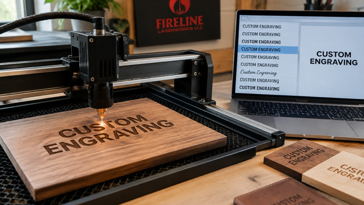
Wood, Leather, and Coated Metal
These materials reward contrast.
Avoid hairline fonts here. The beam leaves a fuzzy edge on thin strokes, and grain can swallow detail on wood.
Glass, Acrylic, and Slate
For a deeper look at substrates and power settings, see our guide to the best materials for custom laser engraving.
Best Fonts for Engraving Metal
Metal is the most unforgiving substrate for font choice because the mark is often a contrast change rather than a deep cut, and glare hides thin strokes. The right font depends less on style than on whether you are removing a coating or marking bare metal, and on which laser is doing the work.
Coated Metal vs. Bare Metal
- Coated metal (anodized aluminum, powder-coated steel, painted tags) marks by removing or altering the coating. Contrast is high, so medium weights read well and fine detail is possible. Bold sans serifs and sturdy slab serifs with uniform stroke width are the safe picks.
- Bare metal marked with a fiber laser relies on oxidation or annealing for contrast. Thin strokes can disappear under glare, so dense, closed letterforms and bold weights read best on tumblers, tags, and awards. Very fine hairlines may mark but vanish at viewing distance.
Match the Font to the Job
- Awards and plaques: a bold serif gives a formal look and holds up under glare; avoid high-contrast didone serifs with hairline thins.
- Drinkware and tags: a bold sans serif stays clear at small sizes and on curved surfaces.
- Industrial parts: single-line fonts mark fast and clean, and they avoid the double-strike look of outlined fonts on small characters.
Why Stroke Uniformity Matters on Metal
High-contrast fonts, where thins are much narrower than thicks, fail on metal because the thin strokes either fail to mark or mark inconsistently, leaving a broken look. Uniform-stroke fonts mark evenly across the whole character. If you want a serif look, choose a slab serif with near-equal stroke widths rather than a traditional serif with hairline thins.
Laser Type Changes the Answer
- Fiber lasers hold the finest detail on bare metal and tolerate smaller text than other machines.
- CO2 lasers generally cannot mark bare metal without a marking spray or coating, so font choice is secondary to getting a mark at all.
- Diode lasers with a metal marking option produce lower contrast, so favor bold weights and larger sizes.
Want to judge how letterforms actually render on metal? Browse our photographic samples of custom engraving and design work to see real finished pieces.
Watch out: polishing or handling after marking can remove a light anneal mark on bare metal, so test the post-processing step on the same scrap before committing a batch.
Connected Fonts for Laser Cutting
Connected fonts for laser cutting are script and stencil designs built so letters and inner shapes stay attached.
The fix is simple. Use a stencil font, or add bridges so every island connects to the main body. For script looks, choose a version with connected letterforms and no floating pieces.
Test on scrap first. A single cut tells you more than any preview.
Using a Laser Cut Font Generator Without Losing Quality
A laser cut font generator converts text into cut-ready vector paths, but the output quality depends on the settings you choose. These tools are handy for quick layouts, yet their output quality depends on the settings chosen.
Follow these steps to keep quality:
- Type your text and pick a stencil or connected style.
- Set stroke width to at least the minimum your machine can cut cleanly.
- Turn on bridging so inner shapes stay attached.
- Export as vector, not raster.
- Check the paths in your design software before cutting.
Watch out: generators often default to thin strokes that look fine on screen and fail on the bed. Always inspect the exported file.
Match Size, Spacing, and Stroke to Your Engraving Area
Small text is where good font choices fail, and most guides stop at "make it big enough." That is not actionable. The useful approach is to set starting ranges by material and machine type, then validate them with a test grid before you commit to a production run.
Starting Ranges by Material
Treat the values below as a first test, not a guarantee.
| Material | Minimum Cap Height | Minimum Stroke Width | Notes |
|---|---|---|---|
| Wood (solid, tight grain) | 0.12 in | 0.016 in | Grain direction can swallow thin strokes; test both orientations |
| Wood (open grain, e.g. oak) | 0.16 in | 0.020 in | Open pores blur fine detail |
| Acrylic (cast) | 0.10 in | 0.012 in | Frosted mark; bold strokes read best |
| Acrylic (extruded) | 0.12 in | 0.016 in | Can bubble or craze at high power |
| Coated metal (anodized, painted) | 0.08 in | 0.010 in | Contrast comes from removing coating, not melting metal |
| Bare metal (fiber marking) | 0.06 in | 0.008 in | Fiber marking holds fine detail better than CO2 |
| Glass | 0.14 in | 0.018 in | Micro-chipping at edges; avoid hairlines |
| Leather | 0.12 in | 0.016 in | Uniform strokes burn cleanly; thin strokes char |
| Slate / stone | 0.18 in | 0.024 in | Textured surface eats detail |
Adjust for Your Laser Type
Machine type changes the floor more than most people expect.
- Diode lasers have a larger, less concentrated spot than CO2 or fiber, so fine strokes blur. Add roughly 20-30% to the stroke minimums above and favor medium-bold weights.
- CO2 lasers handle fine detail well on organics (wood, acrylic, leather) but struggle to mark bare metal without a coating or marking spray.
- Fiber lasers mark bare metal with the tightest spot and hold the smallest text, which is why industrial part marking tolerates 0.06 in cap heights.
Spacing and Kerning Rules
Tight kerning closes counters and turns words into blobs. As text shrinks, open the spacing.
- At large sizes (signs, plaques), normal spacing is fine; watch for over-wide gaps that break the word apart.
- At medium sizes (tumblers, cutting boards), set spacing slightly loose.
- At small sizes (tags, pens), set spacing loose and drop any font with closed counters or tight internal gaps.
Validate With a Test Grid
Never trust a preview. Build a test grid on scrap of the actual material:
- Set your chosen font at three sizes: your target size, one step smaller, and one step larger.
- Run the same text in three weights: regular, medium, bold.
- Include one line at your planned spacing and one line at tighter spacing.
- Engrave or cut the grid, then inspect under magnification and at normal viewing distance.
- Pick the smallest combination that stays legible at the distance your customer will actually view the piece.
Watch out: a font that passes on scrap can still fail on a curved surface like a tumbler, because the rotary attachment changes focus across the curve, test on a curved offcut or a sacrificial tumbler before running the batch.
Once your font and layout are set, you can browse available products for engraving and custom design to match the type to real engraving areas. When you are ready, tell us what you want to make and we will help you finalize the details.
Frequently Asked Questions
What are the best font styles for laser engraving?
Bold or medium-weight sans serif fonts work best for most laser engraving because their uniform strokes and open counters stay legible at small sizes. For wood, leather, and coated metal, a clean sans serif with a bold stroke generally produces crisp results. Script fonts can work for larger decorative pieces but lose fine hairlines on textured materials. Always run a test engraving on scrap before committing to a full production run.
Which fonts work best for engraving metal?
Medium to bold sans serifs with even stroke weight generally work best for engraving metal. Metal reflects light, so thin hairlines and high-contrast serifs can wash out under glare. Avoid fonts with very fine connecting strokes. On coated metal, the engraving removes the coating for contrast, so a simple, open letterform reads more clearly than an ornate script.
How do you make small engraved text readable?
Keep engraved text reasonably large, maintain sufficient stroke width, and add letter spacing so characters do not bleed together. Choose a sans serif with a large x-height and open counters. For connected fonts, use them only at larger sizes; small connected letters can merge into a blur. Run a test engraving at final size on the same material before production to confirm readability.
What is the difference between engraving fonts and laser-cut fonts?
Engraving fonts are designed for marking a surface, so they need uniform strokes and enough weight to show contrast without cutting through. Laser-cut fonts are meant to be cut out completely, so connected fonts and stencil fonts work well because they keep letters attached to the surrounding material. A stencil font with bridges prevents the inner pieces of letters like A or O from falling out. Choose based on whether you want a mark or a cut shape.
Choosing the right font takes a little testing, but it protects every piece you make. At Fireline Laserworks, we bring more than 50 years of professional design experience to each project, with custom design help and a proof process so you can see the finish before production starts. We handle both small custom orders and larger batch runs across wood, leather, glass, and coated metal. Get started with Fireline Laserworks and turn your text into clean, intentional engraving.
